In a DNP quality improvement project, the goal is usually translating evidence into practice to improve patient care, healthcare delivery, and nursing practice. At Research Data Experts, we understand that in your DNP quality improvement project, you focused on enhancing health, practice, or policy outcomes. Now, you are at the stage where you need to analyze the data you have collected after implementing the intervention in your quality improvement project. Our research data experts have the skills you need, especially if you are required to analyze the data you collected using a Run Chart.
The run chart data analysis services for a quality improvement project offered by our research data experts are aimed at deriving insights from the data to identify trends and patterns over a specific period, which should be 14 weeks, or have at least 14 data points. The ultimate goal is to answer your PICOt question, resulting in determining whether the intervention resulted in an improvement in the process, structure, and outcome measures in your quality improvement project.
We understand how to create a run chart and accurately label the axis and data. Our research data experts know that the use of a run chart in data analysis allows for displaying data in a time-oriented sequence. Our run chard research expert ensures that the time is plotted along the X-axis, and the appropriate scale for the data along the Y-axis. The time on the X-axis can be days, months, or quarters. Get assistance with your quality improvement data analysis from experts who understand that the body of the run chart contains each value in consecutive order, which is connected by a line. A measure of central tendency is added to the run chart as the data re-plotted. The measure of central tendency in a run chart is the median, which is the point at which half of the data points are above the line and half of the data points are below the line.
Run Chart Rules for Data Analysis in a Quality Improvement Project
A run chart should have at least 14 points for adequate power to derive conclusions. The four rules of detection are applied to each run chart to determine whether or not the run chart contains the following special-cause signals (Ogrinc et al.):
- Special-cause signal #1: A shift in the process with seven or more consecutive points on one side of the median.
- Special-cause signal #2: A trend of seven or more points continually increasing or decreasing
- Special-cause signal #3 – Too few of too many runs, which our run chart research experts use as an assessment of the overall variability in the data. A run in this context is defined as a group of successive points on one side of the median. As such, if points fall on the median, that is not considered to be part of the run because it does not add information about variability in the data. The number of runs is used as an estimate of the overall variability in the data, which is determined from probability statistics and is identified in a statistical table that offers the known and high expected numbers of runs per the total number of points in a chart.
- Special-cause signal #4: Astronomical data point: The presence of any data points that stand out as being very far away from the others, which people involved in the quality improvement project would agree appear highly unusual.

Get Run Chart Data Analysis services for a DNP quality improvement project to assess the effectiveness of change. Specifically, your implemented intervention.
This is how we draw a Run Chart for a DNP quality improvement project:
1. We obtain a set of ≥ 10-15 data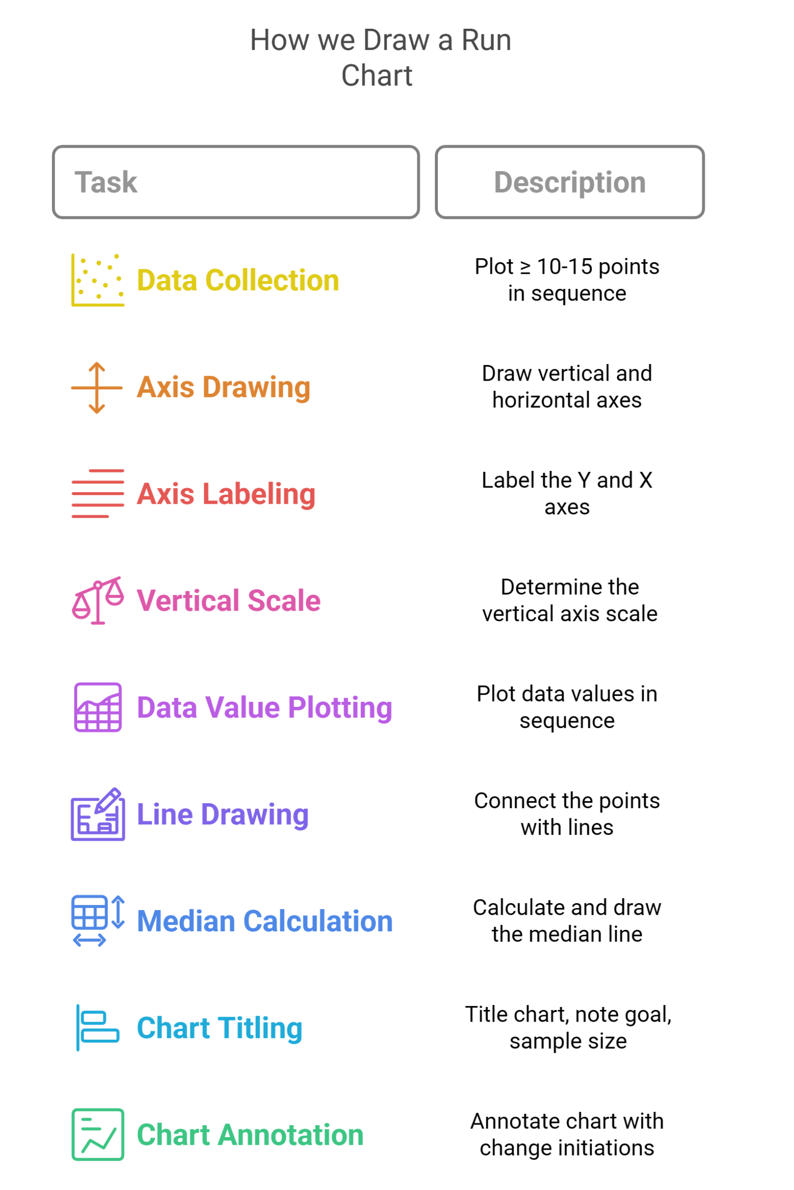 points in time sequence and plot them in a line graph.
2. Our expert draws vertical and horizontal axes, leaving space on all sides for labeling and titling the graph.
3. The data expert labels the Y and X axes.
4. The quality improvement research data expert determines the scale of the vertical axis.
5. The research expert plots the data values in the sequence of their occurrence.
6. Our research data expert draws lines to connect the points in the graph.
7. We calculate the median of the plotted numbers and draw a line of the graph.
8. Our expert titles the chart and notes the goal line and sample size.
9. The run chart expert annotates the chart indicating when the key tests of change were initiated.